


PROJECT CLOSEUP: Claremont Savings Bank Website
ONLINE PROJECTS teach me most of my new lessons these days. One example is this project for Claremont Savings Bank in early 2016, when I tackled my first responsive design website.
77% of Americans now own smartphones according to Pew Research, and industry pollsters say eight out of 10 Internet users regularly access the net from a smartphone. That's why a responsive design website is so valuable, working equally well on big desktop monitors or tiny mobile devices. Unfortunately, CSB’s decade-old website didn't work well on either.

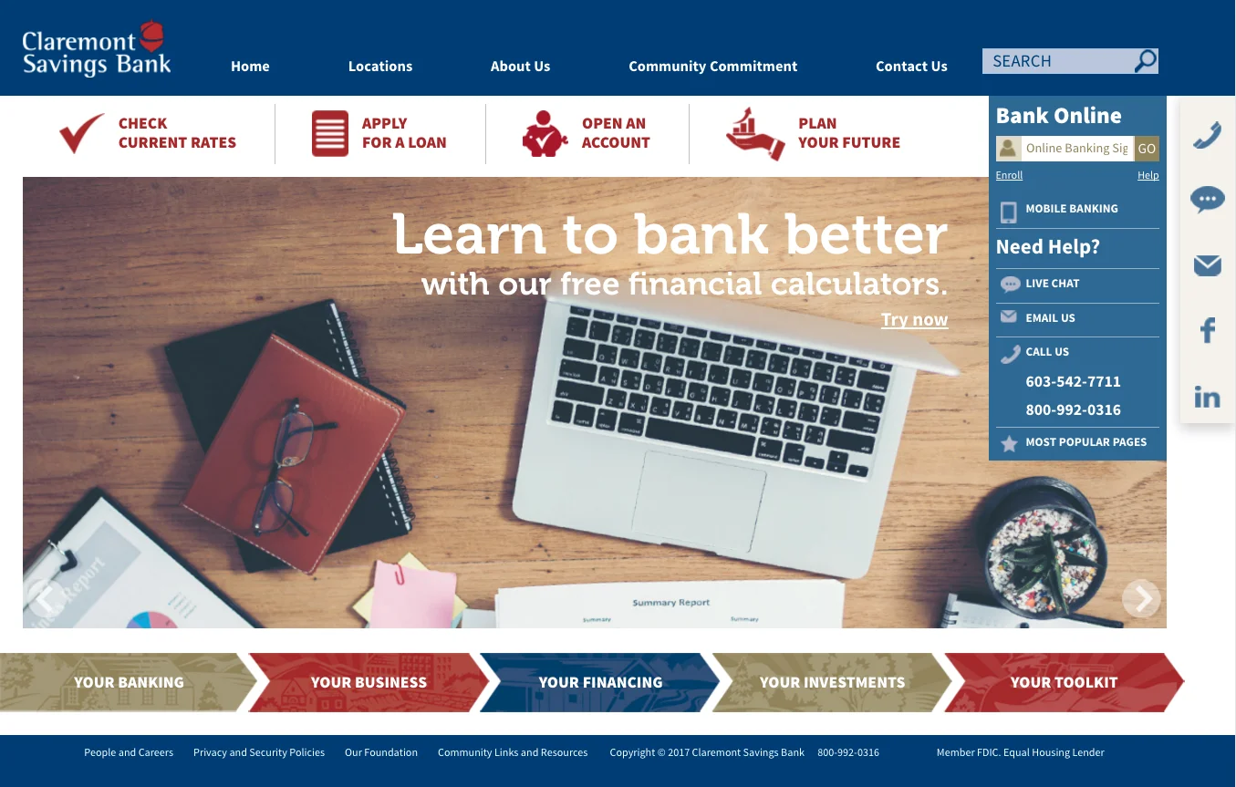
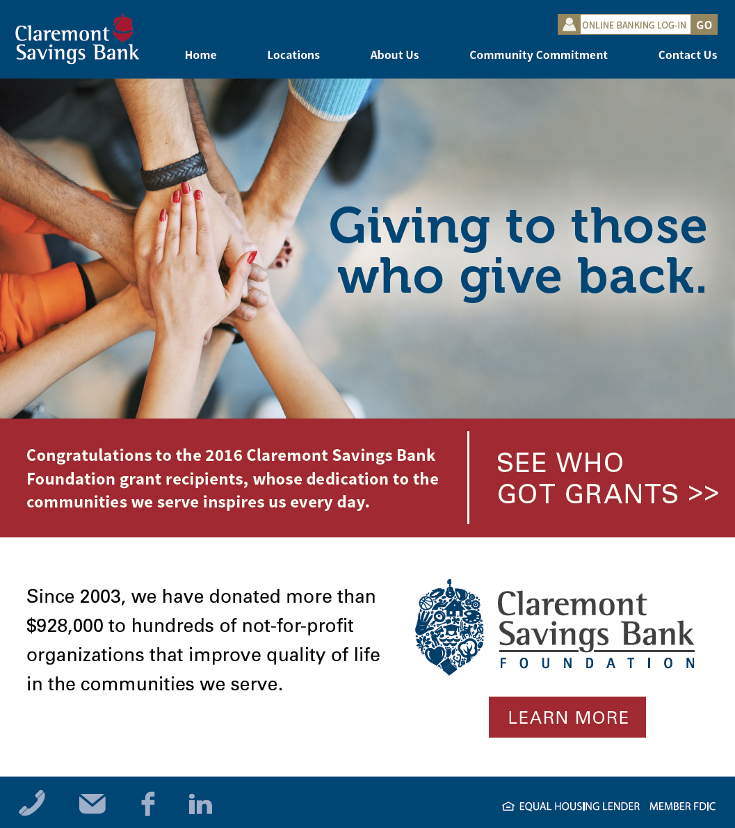
Claremont Savings Bank's old site didn't work with mobile devices -- or goals such as growing online revenues.
CSB wanted a virtual branch, but all they had was an online brochure. Big scenic photos wasted valuable real estate while requiring device users to scroll madly for content. Top navigation was cluttered and passive, giving customers no encouragement to make transactions online. Plus it seemed all about the bank, not about the customers.
A "Sandwich" Approach to Responsive Design
CSB’s web project required some 80 pages of online content, typically in the form of legacy material that would receive only a modest streamlining due to budget constraints. This put me in an unusual position: brainstorming structure, rather than form.
I studied a variety of responsive bank websites to get a handle on the job. The immediate metaphor that came to mind was a submarine sandwich: a long slice of bread on top with essential navigation, then big interactive buttons that would serve as toppings to go with “meaty” fillings such as dynamic sliders, promos, news alerts and customer-friendly tools. The bottom slice was liberally spread with lesser navigation links such as careers, privacy and security, and so on.
This "sandwich" ended up featuring six layers of content, splicing old legacy content with new material to make the format work. The new homepage still bears a family resemblance to the old one, but it's dramatically better from a customer's viewpoint:

Customers on mobile devices could check rates, apply for loans, open accounts and plan for their financial goals.
Content Structure: More Sections, Fewer Pages
In print and most online media, keeping content short and "above the fold" is a priority. But a new conceptual challenge for me was consolidating all those pages of legacy material into a link-centric structure that could be easily navigated on a smartphone screen without slow, tedious scrolling.
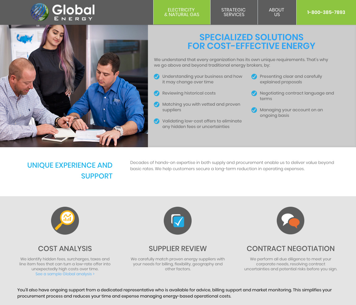
What I came to realize was that a responsive design page is ideally like the elevator shaft in a 10-story building. You're fine as long as there's a button for the floor you want. The page below serves as an example of content offering fast, easy drill-down access to the material customers wanted.

A mobile device's navigable snapshot is the size of a business card, so "breadcrumb" nav links and collapsible buttons help reduce scrolling.
Lessons Learned: Hallmarks of Responsive Design
Easy Navigation: If impatient mobile visitors can’t access key functions directly from your homepage or landing page, you’ll suffer from high drop-off rates. Add a vertical list of shortcut buttons or an icon-driven grid so visitors can shop, compare, buy, download or demo right away.
Scroll-free Content: Smartphone users want a navigable snapshot about the size of a business card. If you feature sprawling text and imagery that require endless scrolling, your site is probably an annoying time-waster. Compartmentalize everything with tabbed or collapsible content and image sliders, so the big picture is always in view.
Big Touch Targets: Are you frustrating touchscreen tappers with tiny buttons they can’t lay a finger on? Follow the lead of smart interface designers like Apple and upsize touch targets such as buttons or icons, so the first easy tap on their touchscreen takes them precisely where they want to go.
Instant Help Options: If you don’t have click-to-call, click-to-text or online chat buttons clearly featured, you’re missing the chance to answer questions, make sales and build loyalty. Put one-touch contact options on your homepage and “Contact us” page. These users have phones in their hands, so they’re ready to engage.
Videos: The vast majority of consumers find videos helpful when making buying decisions online, and mobile users find them especially valuable because they pack a lot of information within a small space. In fact, some studies I've seen show that videos can increase conversions by nearly 13% on average. And that might be a conservative figure.
A great thing about advertising is that even a grizzled old-timer can learn new things. So stay tuned. I have some other websites in the pipeline that I hope to share soon. | DC |